As a newcomer in the field of data science, is the first algorithm you touched a linear regression? When you use it for different data sets, you will find it very simple and convenient, but many of the problems in reality are non-linear, and the dependence of the linear relationship between the dependent variable and the independent variable sometimes does not work. At this point, you have tried polynomial regression, although most of the time it gives better results, but in the face of highly variable data sets, your model will also frequently fit.

Overfitting
Our models are always too flexible, which is not appropriate for "invisible" data. You may have heard of weighted least-squares, kernel smoothers, and local polynomial fittings, but when it comes to estimating unknown functions in the model, spline estimates still occupies Important location. This article will provide a brief introduction to one of the methods of spline estimation, the regression spline and its Python implementation, through the basics of linear and polynomial regression.
Note: This article is from Indian data scientist Gurchetan Singh, assuming that the reader has a preliminary understanding of linear regression and polynomial regression.
table of Contents
1. Understand the data
2. Linear regression
3. Linear regression improvement: polynomial regression
4.Regression spline method and its realization
Piecewise step function
Base function
Piecewise polynomial
Limits and splines
Cubic spline and natural cubic spline
Select the number and location of nodes
Comparison of Regression Spline and Polynomial Regression
Understand the data
In order to understand these concepts, we must first mention this yellow, "cute", brick-like textbook: "An Introduction to Statistical Learning with Applications in R." A few days ago, many people on Twitter forwarded a paragraph saying that someone had found a broken "Introduction to Statistical Learning" on the side of the road, with an empty vodka bottle and an empty cigarette case lying on the side. Toxic" please understand.
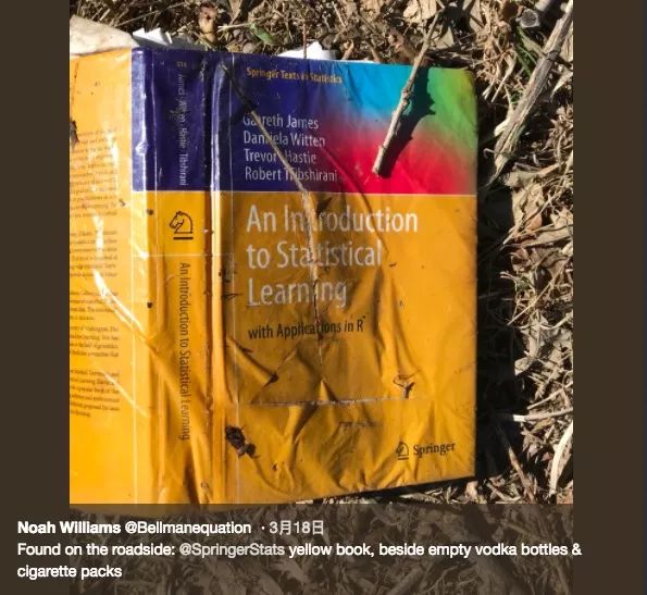
Sex, alcohol and SVM
The book mentions a salary forecast data set that interested readers can download here. This data set contains information such as identity ID, year, age, gender, marital status, ethnicity, education level, location, job category, health status, insurance contributions, and salary. To introduce spline regression, here we use "age" as an independent variable and use it to predict the target's wages (dependent variables).
Process the data first:
# Import module
Import pandas as pd
Import numpy as np
Import statsmodels.api as sm
Import matplotlib.pyplot as plt
%matplotlib inline
#读数æ®_set
Data = pd.read_csv("Wage.csv")
Data.head()

Data_x = data['age']
Data_y = data['wage']
# Split data into training set and test set
From sklearn.model_selection import train_test_split
Train_x, valid_x, train_y, valid_y = train_test_split(data_x, data_y, test_size=0.33, random_state = 1)
# Visualization of age and wage relationship b/w
Import matplotlib.pyplot as plt
Plt.scatter(train_x, train_y, facecolor='None', edgecolor='k', alpha=0.3)
Plt.show()
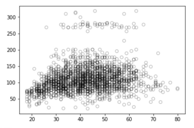
Looking at this picture, do you have any thoughts on these discrete points? Are they positive, negative or totally irrelevant? You can talk about your thoughts in the comments section. But don't worry, let's do some analysis first.
Linear regression
Linear regression is an extremely simple and widely used statistical method for predictive modeling. As a supervised learning algorithm, it can solve the regression problem. When we establish a linear relationship between the dependent variable and the independent variable, we get a linear model. From a mathematical perspective, it can be thought of as a linear expression:

In the above formula, Y is the dependent variable, X is the independent variable, which is what we often say, and β is the weight coefficient assigned to the feature, which indicates the importance of each feature to the final prediction result. For example, if we set X1 to have the greatest influence on the result of the equation, then the value of β1/weight will be greater than the quotient of other coefficients and weights compared with other features.
So, if there is only one feature in our linear regression, what will this equation look like?

We call this linear regression with only one independent variable a simple linear regression. Since the previous goal was to predict the employee's "salary" based on "age", we would perform a simple linear regression on the training set and calculate the model's error (mean squared error RMSE) on the test set.
From sklearn.linear_model importLinearRegression
# Fit linear regression model
x = train_x.reshape(-1,1)
Model = LinearRegression()
Model.fit(x,train_y)
Print(model.coef_)
Print(model.intercept_)
-> array([0.72190831])
-> 80.65287740759283
# Forecast on test set
Valid_x = valid_x.reshape(-1,1)
Pred = model.predict(valid_x)
# Visualization
# We will choose 70 plots between the minimum and maximum values ​​of valid_x
Xp = np.linspace(valid_x.min(), valid_x.max(), 70)
Xp = xp.reshape(-1,1)
Pred_plot = model.predict(xp)
Plt.scatter(valid_x, valid_y, facecolor='None', edgecolor='k', alpha=0.3)
Plt.plot(xp, pred_plot)
Plt.show()
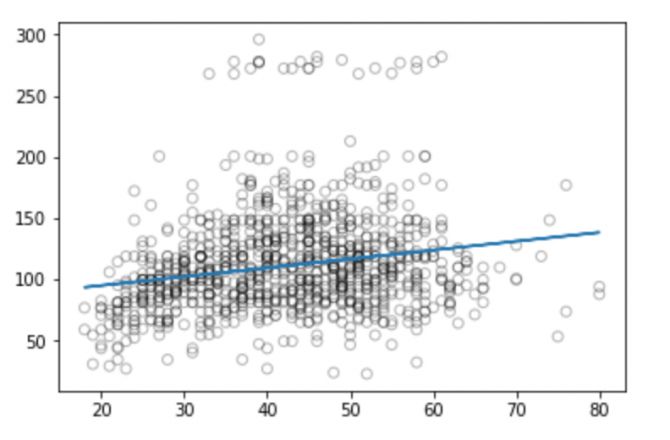
Now we can calculate the RMSE predicted by the model:
From sklearn.metrics import mean_squared_error
From math import sqrt
Rms = sqrt(mean_squared_error(valid_y, pred))
Print(rms)
-> 40.436
From the figure we can see that linear regression can't capture all the available signals, and the results are not very good.
Although the description and implementation of a linear model is relatively simple and has advantages in terms of interpretation and reasoning, it does have significant limitations in performance. The linear model assumes a linear relationship between the individual independent variables, but unfortunately this is always an approximation of a straight line fit, and sometimes its accuracy will be poor.
Since the accuracy of the linear model is general, we temporarily put the linear hypothesis aside and extend it on the basis of it, such as using polynomial regression, step function, etc. to improve the performance of the model.
Linear regression improvement: polynomial regression
Let's take a look at these visual images:

Compared to the linear regression of the graph, the curve in the above graph seems to better fit the distribution of wage and age signals, which are nonlinear in shape. Like this approach using nonlinear functions, we call it a polynomial regression.
Polynomial regression extends the linear model by adding additional predictors. The most straightforward approach is to add a power operation (power) to the original independent variable. For example, a cubic regression will use X1, X22, and X33 as independent variables.
A standard way to extend linear regression to the nonlinear relationship between dependent and independent variables is to replace the linear model with a polynomial function.

If we increase the order value, the whole curve will have high frequency oscillation, and the consequence is that the model is over-fitting.
# Generate weights for quadratic regression functions, degree = 2
Weights = np.polyfit(train_x, train_y, 2)
Print(weights)
-> array([ -0.05194765, 5.22868974, -10.03406116])
# Generate a model with a given weight
Model = np.poly1d(weights)
# Forecast on test set
Pred = model(valid_x)
# Draw with 70 observations
Xp = np.linspace(valid_x.min(), valid_x.max(), 70)
Pred_plot = model(xp)
Plt.scatter(valid_x, valid_y, facecolor='None', edgecolor='k', alpha=0.3)
Plt.plot(xp, pred_plot)
Plt.show()
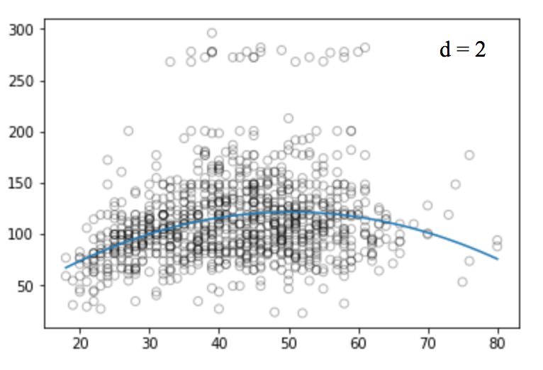
Similarly, we can increase the power of the function (d) and look at the images of the four, twelve, sixteen, twenty-five regression functions:

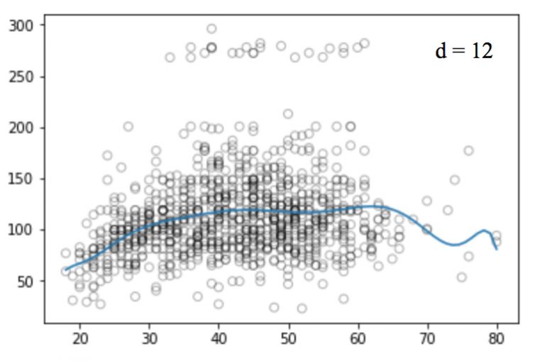
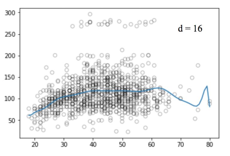
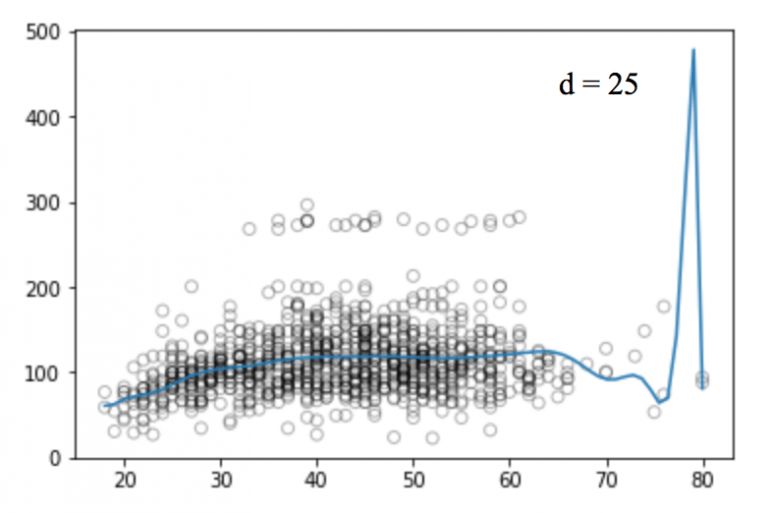
Like linear regression, polynomial regression has many shortcomings. On the one hand, as the equation becomes more complex, the number of functions will gradually increase, which makes it difficult for us to deal with them. On the other hand, as shown in the above figure, even in such a simple one-dimensional data set, the higher the power, the more signal points the curve passes, and the more the shape is different. At this time, the model has a tendency to fit. It does not derive the general law from the input and output, but simply remembers the results of the training set. Such a model will not have good performance on the test set.
There are other problems with polynomial regression, such as it is non-local in nature. If we change the Y value of a point on the training set, this will affect the fit of the polynomial to a point in the distance. Therefore, to avoid using higher-order polynomials over the entire data set, we can use multiple different low-order polynomial functions instead.
Regression spline method and its implementation
In order to overcome the shortcomings of polynomial regression, a feasible improvement method is not to divide the training set as a whole, but to divide it into multiple continuous intervals and fit it with a separate model. This method is called a regression spline.
The regression spline method is one of the most important nonlinear regression methods. In ordinary polynomial regression, we generate new features by using polynomial functions based on existing features, which have a global impact on the data set. To solve this problem, we can divide the data distribution into different parts and then fit linear or nonlinear low-order polynomial functions for each part.
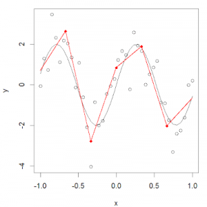
We call the red dot of these partitions a knot, and the function that fits a single interval data distribution is called a piecewise function. As shown in the figure above, this data distribution can be fitted with multiple piecewise functions.
Piecewise step function
The step function is one of the most common piecewise functions, and it is a function that remains constant over a certain interval. By using a step function, we can divide the range of X into several bins and fit different constants in each interval.
In other words, suppose we set K nodes in the X range: C1, C2,..., CK, and then build K+1 new variables:
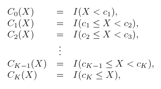
I( ) is an indication function that returns 1 if it is within the range, ie if the condition is true; otherwise returns 0.
# Split the data into 4 consecutive intervals
Df_cut, bins = pd.cut(train_x, 4, retbins=True, right=True)
Df_cut.value_counts(sort=False)
->
(17.938, 33.5) 504
(33.5, 49.0) 941
(49.0, 64.5) 511
(64.5, 80.0) 54
Name: age, dtype: int64
Df_steps = pd.concat([train_x, df_cut, train_y], keys=['age','age_cuts','wage'], axis=1)
# Create dummy variables for age groups
Df_steps_dummies = pd.get_dummies(df_cut)
Df_steps_dummies.head()
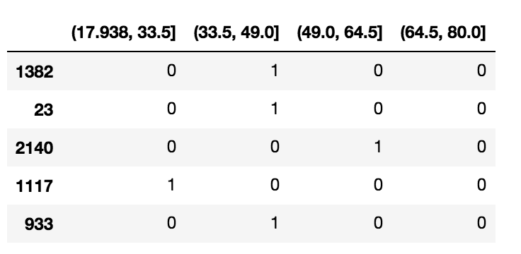
Df_steps_dummies.columns = ['17.938-33.5', '33.5-49', '49-64.5', '64.5-80']
# fitting generalized linear model
Fit3 = sm.GLM(df_steps.wage, df_steps_dummies).fit()
# Correspond to the segmentation function to the corresponding 4 intervals
Bin_mapping = np.digitize(valid_x, bins)
X_valid = pd.get_dummies(bin_mapping)
# Delete outliers
X_valid = pd.get_dummies(bin_mapping).drop([5], axis=1)
# Forecast
Pred2 = fit3.predict(X_valid)
#ç®—RMSE
From sklearn.metrics import mean_squared_error
From math import sqrt
Rms = sqrt(mean_squared_error(valid_y, pred2))
Print(rms)
->39.9
# Draw with 70 observations
Xp = np.linspace(valid_x.min(), valid_x.max()-1,70)
Bin_mapping = np.digitize(xp, bins)
X_valid_2 = pd.get_dummies(bin_mapping)
Pred2 = fit3.predict(X_valid_2)
# Visualization
Fig, (ax1) = plt.subplots(1,1, figsize=(12,5))
Fig.suptitle('Piecewise Constant', fontsize=14)
# polynomial regression line scatter plot
Ax1.scatter(train_x, train_y, facecolor='None', edgecolor='k', alpha=0.3)
Ax1.plot(xp, pred2, c='b')
Ax1.set_xlabel('age')
Ax1.set_ylabel('wage')
Plt.show()
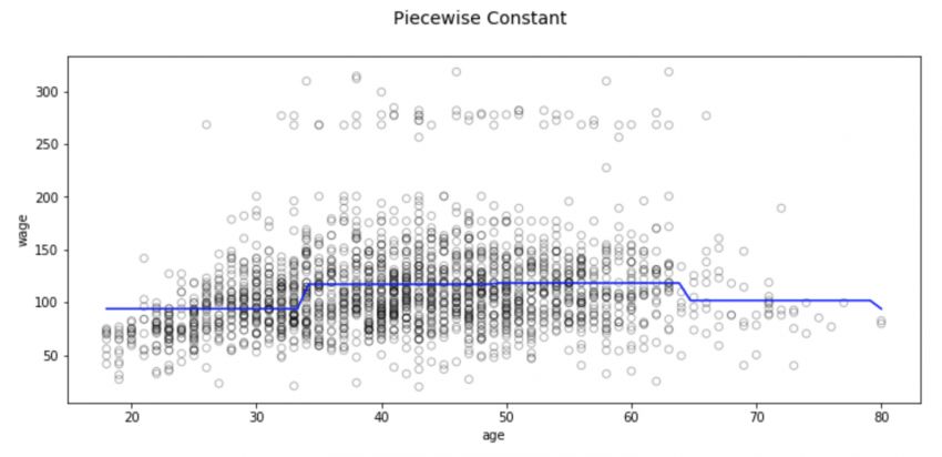
There are also some problems with this partitioning method, the most notable of which is that we expect the input to be different and the output of the model to change accordingly. However, classification regression does not create a continuous function of predictors, so in most cases, its assumption is that there is no relationship between input and output. For example, in the above figure, the function of the first interval obviously does not find that the wages will continue to rise with age.
Base function
In order to capture the nonlinear factors in the regression model, we need to make some transformations for some or even all of the predictors. We hope that this is a very common transformation. It can avoid the model to treat each independent variable as linear. It can flexibly fit the data distribution of various shapes, and it is relatively less flexible. It can effectively prevent it. Fitting.
Like this kind of transformation that can be combined to capture the distribution of data, we call it the basis function, also known as the spline base. In the question of predicting wages based on age, the spline base is b1(X), b2(X),..., bK(X).
Now, instead of fitting the linear model with X, we use this new model:

Let's dive into one of the basic uses of basis functions: piecewise polynomials.
Piecewise polynomial
When introducing the piecewise step function, we introduce it as "divide X into several intervals and fit different constants in each interval", applying the difference between linear regression and polynomial regression. The piecewise polynomial divides X into Several intervals, and fitting different low-order polynomial functions in each interval. Since the power of the function is low, the image does not violently oscillate.
For example, a piecewise quadratic polynomial can work by fitting a binary regression equation:

Among them, β0, β1 and β2 have different values ​​in different intervals. In detail, if we have a data set containing a single node c, its piecewise cubic polynomial should have the following form:

This is actually fitting two different polynomial functions: a subset of observations of xi, and a subset of observations of xi ≥ c. As described above, the coefficients of the first polynomial function are β01, β11, β21, and β31, and the coefficients of the second are β02, β12, β22, and β32. Either of the two functions can be fitted with a minimum mean square error matrix.
One thing to note is that this polynomial function has a total of 8 variables, 4 for each polynomial.
The more nodes, the more flexible the piecewise polynomial, because we assign different functions to each X interval, and the form of the function depends on the data distribution of the interval. In general, if we set K different nodes in the entire X range, we will eventually fit K+1 different cubic polynomials. In theory, we can fit a single interval with any low-order polynomial.
Now let's look at some of the necessary conditions and constraints to follow when designing a piecewise polynomial.
Constraints and splines
There are many functions that can fit the distribution of the target interval data, but the piecewise polynomial cannot be set casually. It also has various restrictions that need to be followed. Let's take a look at this picture:
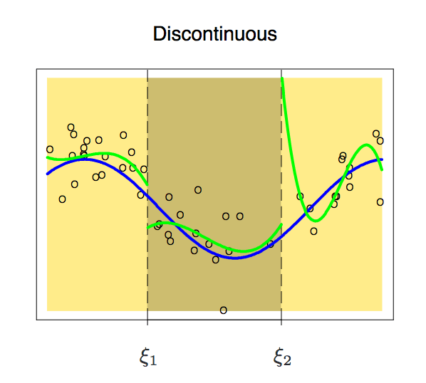
Because it is segmented, the functions of the two intervals may appear discontinuous. To avoid this, an additional constraint is that the polynomial on either side should be contiguous on the node.
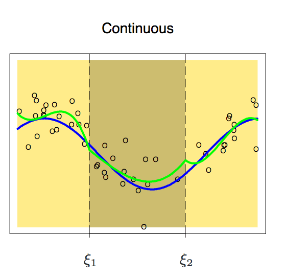
With this constraint added, we get a continuous curve, but does it look perfect? The answer is obviously no. Before reading the following, we can think about one question first. Why can't we accept this unsmooth curve?
According to the above figure, the node is still prominent on the curve. In order to smooth the polynomial on the node, we need to add a new constraint: the first derivative of the two polynomials must be the same. It is worth noting here that for each additional condition we add a degree of freedom to the polynomial, which reduces the complexity of the piecewise polynomial fit. So in the image above, we only used 10 degrees of freedom instead of 12.
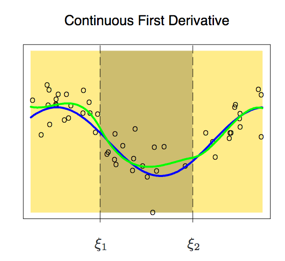
After adding the first derivative, our polynomial is now slightly smoother. At this time, its degree of freedom has also been reduced from 12 to 8. Although the curve has improved a lot, it still has a lot of room for improvement. So now, we apply a new constraint to it: the second derivative of the two polynomials on a node must be the same.
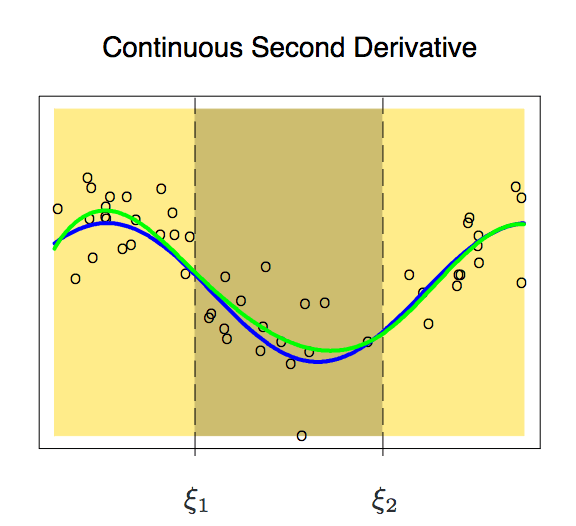
This curve is more in line with our expectations, it has only 6 degrees of freedom. An m-order piecewise polynomial with m-1 consecutive derivatives like this is called a spline.
Cubic spline and natural cubic spline
A cubic spline refers to a piecewise polynomial with a set of constraints (continuity, first-order, and second-order continuity). In general, a cubic spline with K nodes generally has (K+1) × 4-K × 3, that is, K + 4 dimensions. When K=3, the dimension is 8, and the degree of freedom of the image is dimension-1=7. In general, we only use cubic splines.
From patsy import dmatrix
Import statsmodels.api as sm
Import statsmodels.formula.api as smf
# Generate cubic splines on three nodes 25, 40 and 60
Transformed_x = dmatrix("bs(train, knots=(25,40,60), degree=3, include_intercept=False)", {"train": train_x},return_type='dataframe')
#Fitting a generalized linear model on a partitioned data set
Fit1 = sm.GLM(train_y, transformed_x).fit()
# Generate 4 cubic splines
Transformed_x2 = dmatrix("bs(train, knots=(25,40,50,65),degree =3, include_intercept=False)", {"train": train_x}, return_type='dataframe')
#Fitting a generalized linear model on a partitioned data set
Fit2 = sm.GLM(train_y, transformed_x2).fit()
#Two splines simultaneously forecast
Pred1 = fit1.predict(dmatrix("bs(valid, knots=(25,40,60), include_intercept=False)", {"valid": valid_x}, return_type='dataframe'))
Pred2 = fit2.predict(dmatrix("bs(valid, knots=(25,40,50,65),degree =3, include_intercept=False)", {"valid": valid_x}, return_type='dataframe'))
#ç®—RMSE
Rms1 = sqrt(mean_squared_error(valid_y, pred1))
Print(rms1)
-> 39.4
Rms2 = sqrt(mean_squared_error(valid_y, pred2))
Print(rms2)
-> 39.3
# Draw with 70 observations
Xp = np.linspace(valid_x.min(), valid_x.max(), 70)
# Forecast
Pred1 = fit1.predict(dmatrix("bs(xp, knots=(25,40,60), include_intercept=False)", {"xp": xp}, return_type='dataframe'))
Pred2 = fit2.predict(dmatrix("bs(xp, knots=(25,40,50,65),degree =3, include_intercept=False)", {"xp": xp}, return_type='dataframe'))
# Draw spline and error curve
Plt.scatter(data.age, data.wage, facecolor='None', edgecolor='k', alpha=0.1)
Plt.plot(xp, pred1, label='Specifying degree =3 with 3 knots')
Plt.plot(xp, pred2, color='r', label='Specifying degree =3 with 4 knots')
Plt.legend()
Plt.xlim(15,85)
Plt.ylim(0,350)
Plt.xlabel('age')
Plt.ylabel('wage')
Plt.show()
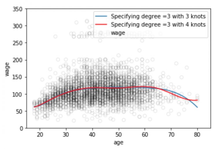
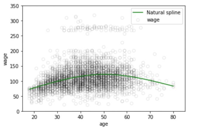
It is well known that the polynomial function of the fitted data distribution is often unstable in the data boundary zone, the known data in the boundary region is small, and the function curve is often over-fitting. This problem also exists in the spline. In order to make the polynomial smoother beyond the boundary nodes, we need to use a special method called natural spline.
Natural cubic splines add a linear constraint to the boundary region compared to cubic splines. Here we explain that the boundary region refers to the region between the maximum/minimum of the independent variable X and the corresponding maximum and minimum nodes, where the signal is sparse, and it is acceptable to simply control the RMSE value with linear processing. At this time, the third and second order of the function becomes 0, each of which reduces 2 degrees of freedom, and these degrees of freedom are in two segments of each curve, so the dimension of the polynomial K+4 dimensions becomes K.
# Generate natural cubic spline
Transformed_x3 = dmatrix("cr(train,df = 3)", {"train": train_x}, return_type='dataframe')
Fit3 = sm.GLM(train_y, transformed_x3).fit()
# Forecast on test set
Pred3 = fit3.predict(dmatrix("cr(valid, df=3)", {"valid": valid_x}, return_type='dataframe'))
# Calculating RMSE value
Rms = sqrt(mean_squared_error(valid_y, pred3))
Print(rms)
-> 39.44
# Draw with 70 observations
Xp = np.linspace(valid_x.min(), valid_x.max(), 70)
Pred3 = fit3.predict(dmatrix("cr(xp, df=3)", {"xp": xp}, return_type='dataframe'))
#ç”»æ ·æ›²çº¿
Plt.scatter(data.age, data.wage, facecolor='None', edgecolor='k', alpha=0.1)
Plt.plot(xp, pred3,color='g', label='Natural spline')
Plt.legend()
Plt.xlim(15,85)
Plt.ylim(0,350)
Plt.xlabel('age')
Plt.ylabel('wage')
Plt.show()
Number and location of nodes
Having said that, how do we choose nodes when we fit the spline? A feasible method is to select the sharply changing regions in the data distribution as nodes, such as the moment of sudden change in the economic phenomenon - financial crisis; the second method is to set more nodes in the place where the data changes are complex, which seems more stable There are fewer nodes to set up, although this can work, but in general we will intercept the same length for the sake of simplicity. In addition, the average allocation of the same number of sample points is the third common method.
Here we briefly introduce the fourth more objective approach - cross-validation. To use this method, we need to:
Take away some of the data;
Fit the spline to the remaining data with a certain number of nodes;
Use the spline to fit the data that was taken before.
We repeat this process until each observation is ignored 1 time and then calculate the RMSE of the entire cross-validation. It can be repeated multiple times for different numbers of nodes, and finally choose to output the K value of the minimum RMSE.
Comparison of Regression Spline and Polynomial Regression
Regression splines generally yield better output than polynomial regression. Because it differs from polynomials, polynomials must flexibly fit the entire data set with higher-order polynomials, while regression splines rely on nodes to ensure overall stability while retaining the flexibility of nonlinear functions.
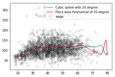
As shown in the figure above, the blue regression spline curve is smoother overall and the captured information is more comprehensive. Stabilization is only one aspect. In addition, the regression spline can adjust the flexibility of the spline by controlling the number of nodes, and it can also add linear constraints to control the result of the curve in the boundary region, which makes it more effective in preventing overfitting.
summary
Written here, this article is nearing completion. Through this article, we learned about regression splines and their advantages over linear regression and polynomial regression. In Getting Started with Statistical Learning, you can further learn another method of generating splines for highly variable data sets called smooth splines. It is similar to the Ridge/Lasso regularization, penalizing the loss function and the smoothing function.
Large Area Of Mid-rise Building Sky Curtain
Large Area Of Mid-Rise Building Sky Curtain,Media Facade Led Display,Led Waterproof Stage Screen,Custom Screen Size Led Panel Display
Kindwin Technology (H.K.) Limited , https://www.szktlled.com